
Care for a Cuppa?
26" x 31"

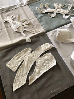
Detail: This piece was created with elements I printed, dyed, stamped, painted, and layered. The cotton fabric began as white. Many of the techniques I experimented with in a Pat Pauly workshop which was fun and joyful and wild. I highly recommend working with Pat. These loose processes were quite outside my perfectionistic mindset and were a very good exercise for me. However, I came home with lots of yardage and wasn't quite sure what to do with it until one day it came to me. The black round prints looked like coffee beans and I could cut the yellow dots to resemble coffee cups and then it came together very quickly and easily. I have many other experiments and half finished projects patiently waiting for my eureka moment on their behalf.

And here it is, installed in its new 'forever home'.


